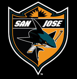
 New Logo
July 24th, 2007, 10:51 am
The Sharks announced their new logo today, along with several accompanying logos, to be used either as patches on the sleeve, or for merchandise. If you are a Sharks fan, chances are you’ve already seen it- it’s been leaked for a couple of weeks now. It’s quite similar to the old logo. The triangle is more curvy, the shark itself is going more down than to the right, and there’s more teal in the shark. Also a yellow-orange is introduced as an accent color, which I kind of hate. Too much like the Ducks. I like this shield crest the best:
This isn’t the right logo for the jersey though. It would be cool as a small front logo on a shirt or something. I might need to get myself a new hat, I lost mine last year. But looking at the online store, they’re still using the old logo, and don’t have any merchandise with the new designs. Way to bungle a sales opportunity, guys.


Orange? – if you can’t beat ’em, join ’em.
And the Black Fin in water seems like a rip off of an old Vancouver logo.
Still a good logo, though.
The fin in water is actually just an update from a very similar version that’s been on the shoulder for years. You can find that one here.
The shield-crest looks pretty sweet. I wasn’t too impressed with the update on the main triangle, but they’ve got another triangle where you can see the whole shark (like on the shield crest) that looks good too.